Challenge
Disney approached our team at frog to rethink the entire customer experience for the booking and onsite experience at the Disney parks and resorts, to balance convenience and utility with the magic of the Disney experience.
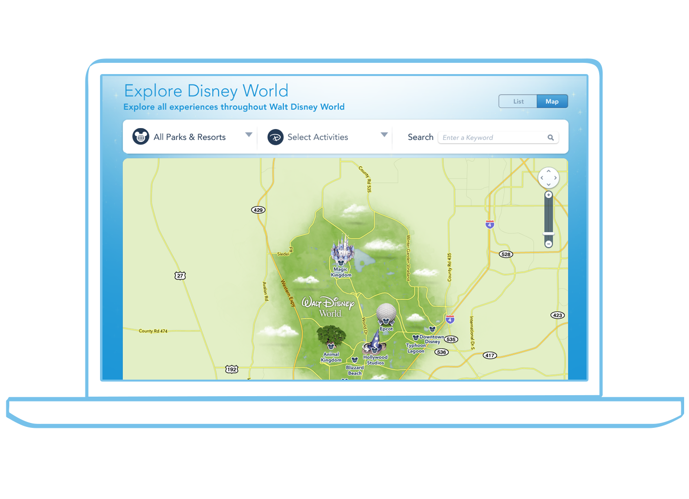
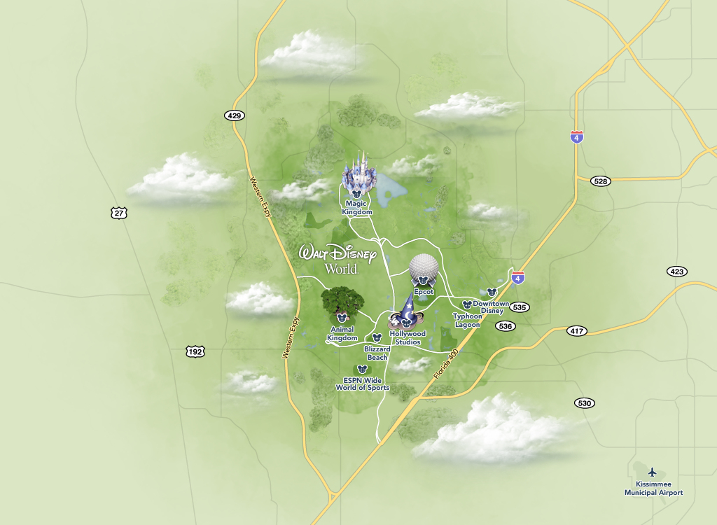
For many guests, that experience starts by exploring the map to plan and visualize their perfect vacation.
Discovery

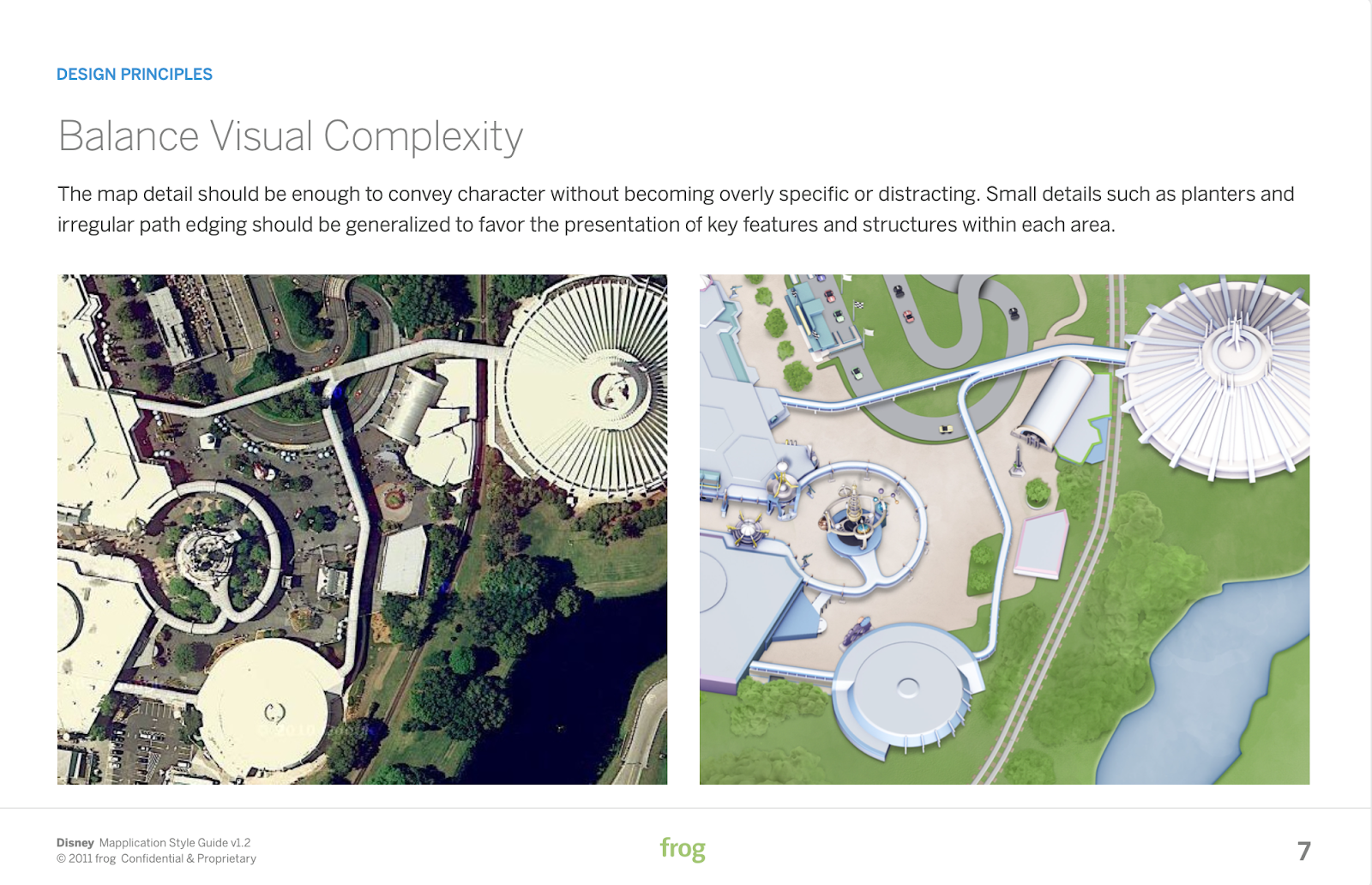
Our team considered a number of creative and technical approaches for the maps within the digital experience, from flat art with overlays to full immersive 3D experiences.
After exploring feasibility and reviewing multiple approaches with the clients over multiple ideation sessions, the determination was made to build the map experience using Google Maps with customized 3D map art and overlays to integrate efficiently across all touchpoints.
Design
Design vision
To begin, I and my team completed audits of all of the existing view levels within Google Maps and conducted a thorough trendscape of the competitive and creative landscape as well as the rich history of Disney theme park maps.
We compiled mood boards structured under key principles to align our stakeholders to a shared vision and guide our visual approach.
Key stakeholder feedback:
- The solution should be something visually rooted in their history
- The execution should be modern and forward thinking
Design explorations
Our team continued by building a sample area of the park and iterating on high-level visual approaches to arrive at a final direction.
We explored possible production outlines using both traditional illustration techniques and digital 3D rendering.
Key findings:
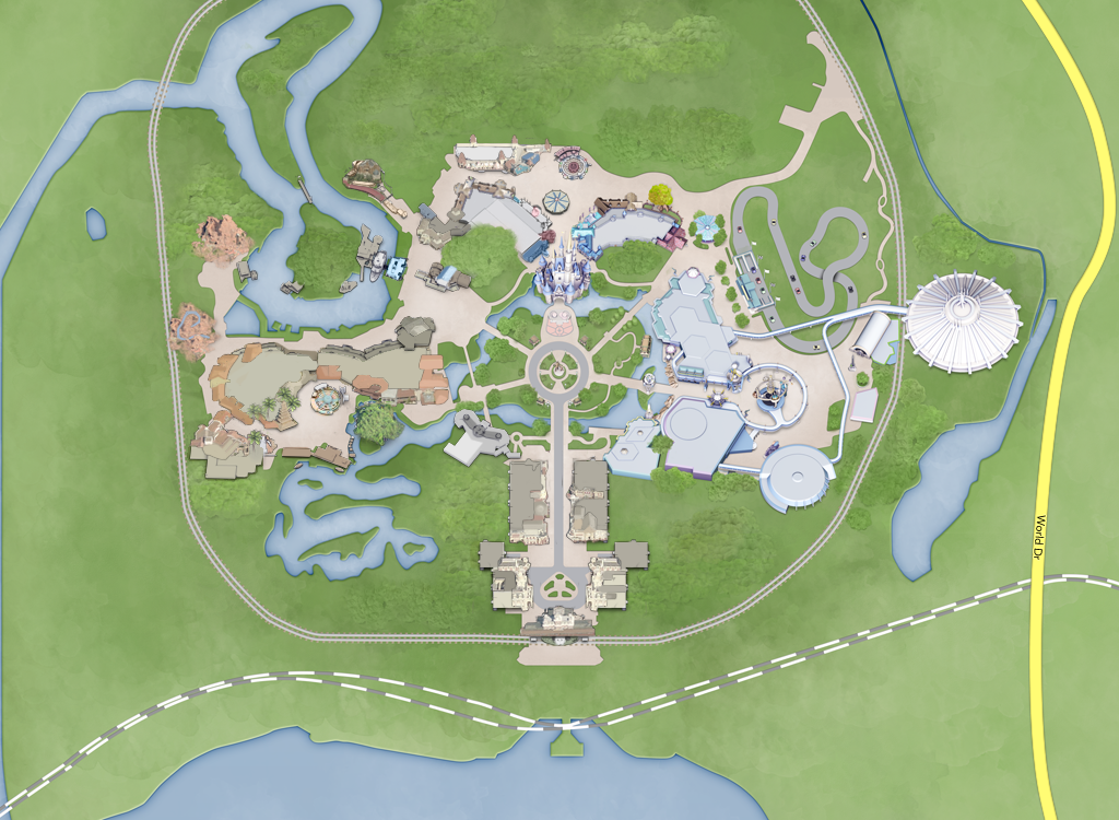
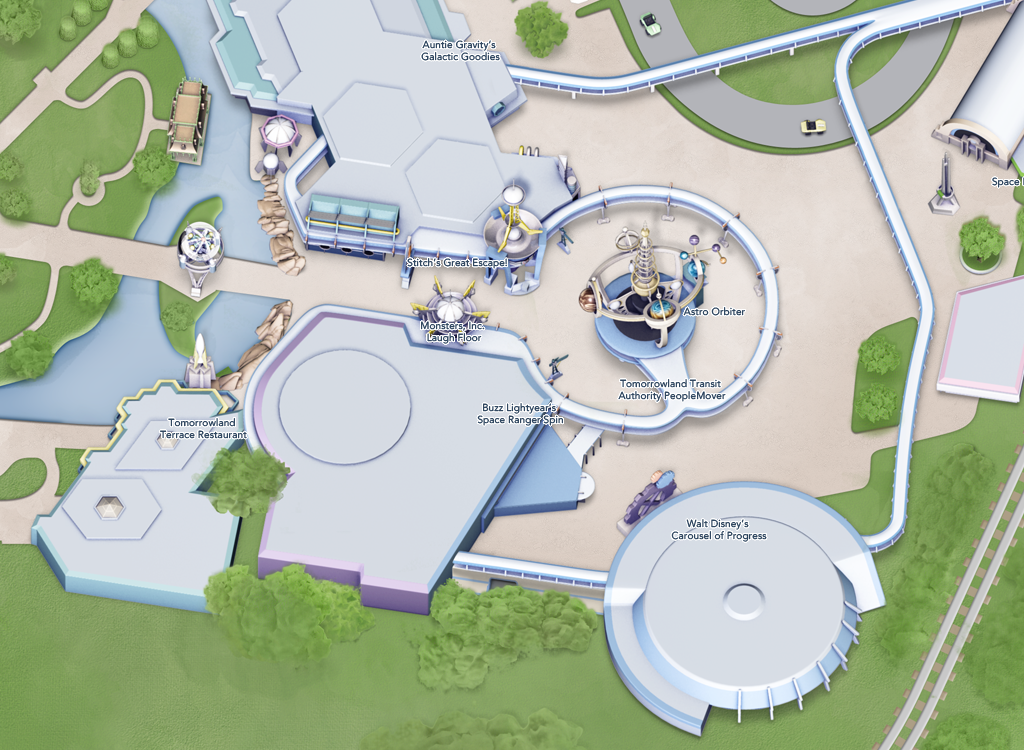
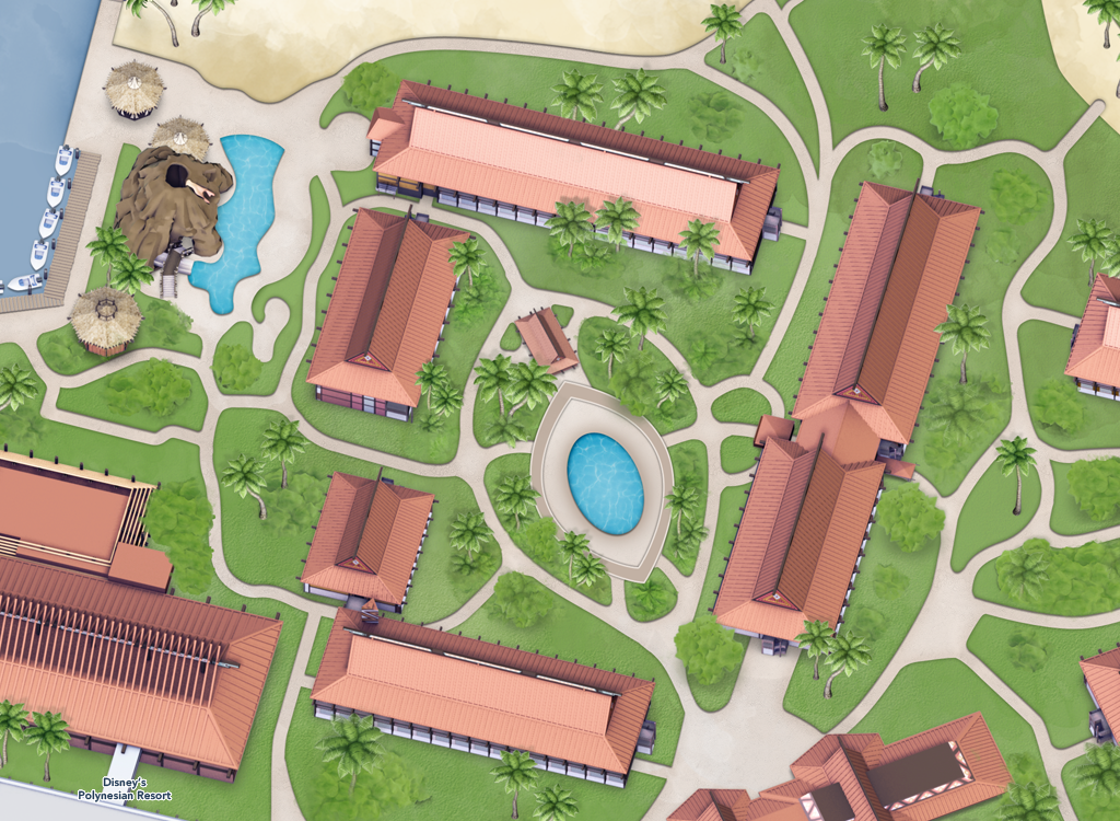
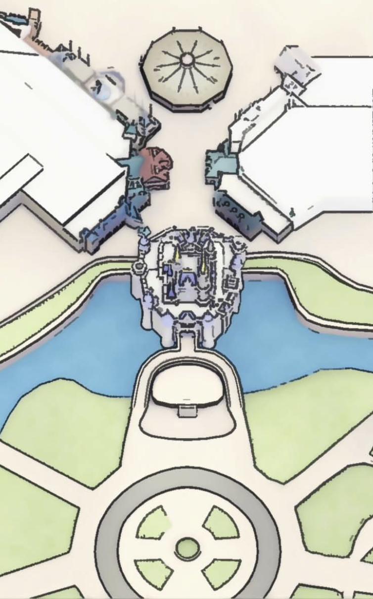
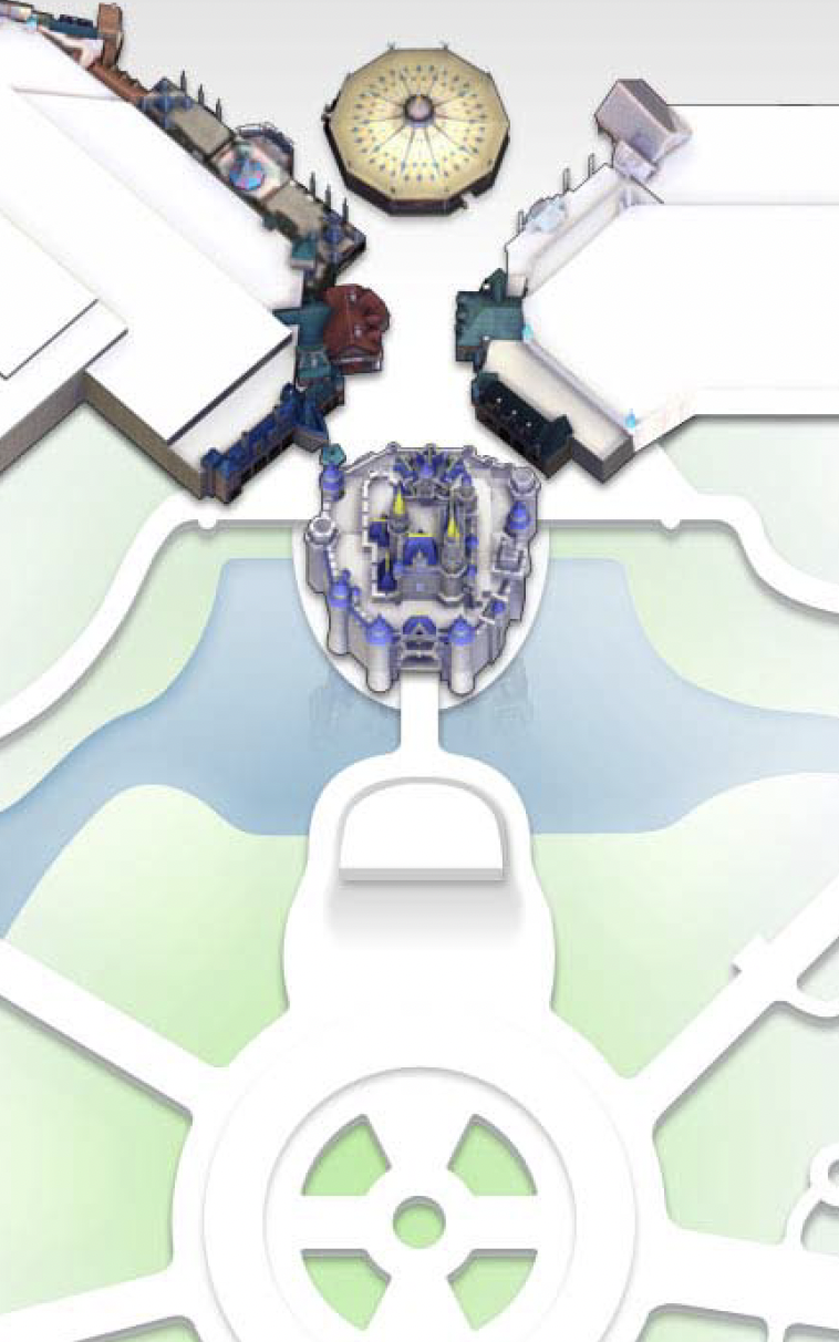
- Combining 3D assets with hand drawn textures produced a suitable visual style that was scalable and repeatable
- Full 3D models of key attractions allowed flexibility for rendering additional views and interactive features in the experience
Final design


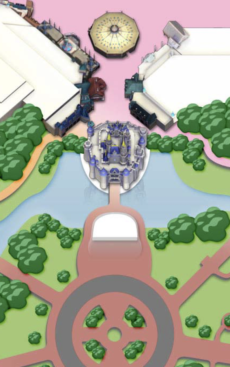
Once the team had a visual direction for the art, we began detailed design. I led my team in defining and testing the guidance for all visual aspects of the park and resorts, from highlighting and enhancing park attractions and features to assets and guidance on how to style foliage, service areas and parking lots.
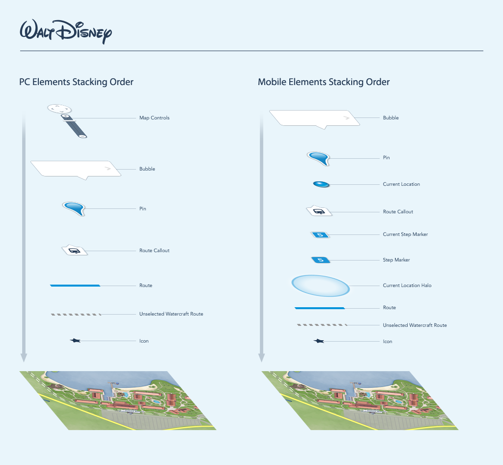
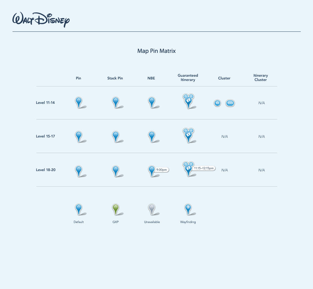
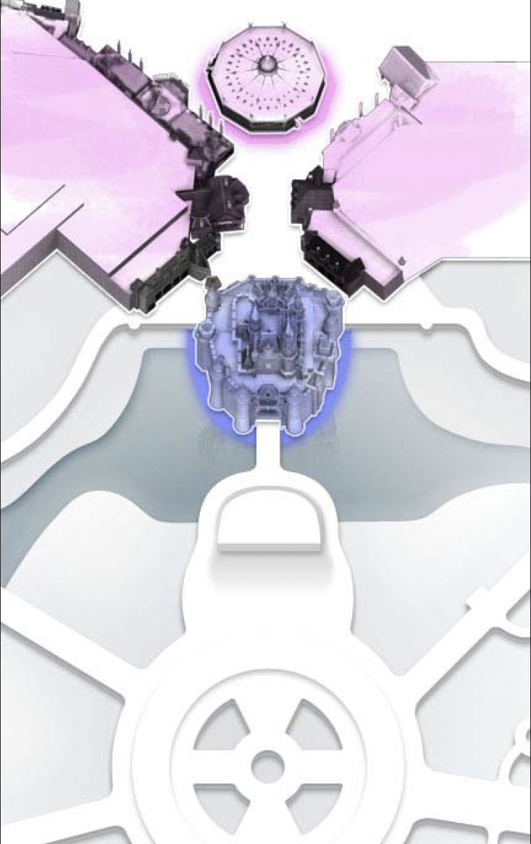
In addition, we developed all of the UI overlay elements and tested them for visibility and integration within the map visuals to prepare optimized assets for implementation.
Key features:
- Constrained use of color and saturation provided a rich visual underlayer for UI elements and text to read clearly on the map
- Creative liberty with the extension of visual elements onto rooftops and service areas of the park enhanced the illusion of the park and provided clarity in visual scanning
- Hand drawn textures on the map ground layer grounded the 3D models in both the history of the vintage maps and overall Disney tradition
Delivery
For the final delivery, I led the development of a comprehensive style guide, with guidance and examples for development of the full system along with templates and resources for implementation.
I worked with the client’s production agency to train and guide their team through the development of assets for a few sample sites. I oversaw the initial rollout and worked together with our client to ensure the integrity and quality of the full launch.
Results
12
Parks completely mapped around the world
50+
Resorts mapped around the world
150M
Yearly visitors utilizing the mapping system
Although the overall UI for the park applications and websites has changed multiple times over the last few years, the visual system that I and my team developed has endured for more than a decade and a half and counting.